
A business website is often one of the first places potential customers interact with a brand. Before making an inquiry, visiting a store, booking a service, or purchasing a product, people may explore several pages to decide whether the business meets their expectations. The quality of that experience can therefore influence trust and engagement from the beginning.
Effective web page design brings structure, content, visual presentation, and usability together. Rather than concentrating solely on appearance, businesses should consider how easily visitors can understand information, move between pages, and complete important actions. Every element should have a clear purpose and contribute to a smooth journey.
For homeware brands, health and wellness businesses, and retailers in Bath, these considerations are particularly valuable in competitive markets where customers may compare several businesses before deciding what to do next. The same principles apply to organisations in any location that want a professional, scalable, and results-driven online presence.This article explores five practical areas businesses can improve to create a clearer, more engaging, and dependable website experience.
Create a Clear and Logical Page Structure
A strong experience starts with structure. Visitors should be able to arrive on a page and quickly understand what it covers, why the information matters, and what they can do next. If important information is scattered across an unclear layout, users may become frustrated or leave before exploring the business further.
Page hierarchy helps prevent this problem. Important information should normally appear early, followed by supporting details that answer common questions and provide additional context. Headings and subheadings can divide longer pages into manageable sections, while short paragraphs make information easier to scan.
The relationship between individual pages is equally important. Services, products, company information, resources, and contact details should be grouped logically so that visitors do not have to guess where information is located. Familiar navigation labels are generally more helpful than unusual wording that requires interpretation.
Thoughtful website design also considers how different pages work together rather than treating each one as a separate visual project. Consistent headers, navigation patterns, content widths, and calls to action create familiarity as visitors move around the site.
Businesses should also consider the amount of information presented at one time. Providing too little can leave visitors with unanswered questions, while excessive detail can make a page difficult to absorb. A clear hierarchy allows essential information to stand out while still giving users access to further details when required.
Good structure also supports future growth. If new products, services, or resources need to be introduced, an organised framework makes expansion easier without creating confusing navigation. This is particularly useful for businesses that expect their digital presence to develop alongside their operations.
Make Navigation Simple and Predictable
Navigation should help visitors move around a website without requiring unnecessary thought. Simple, familiar navigation patterns reduce friction and allow users to concentrate on the business rather than figuring out how the site works.
Several practical principles can make navigation more effective:
- Keep the main menu focused on the pages visitors are most likely to need.
- Use clear labels that accurately describe the content behind each link.
- Group related pages together so users can understand how different areas of the site connect.
- Avoid excessively deep menus that require visitors to move through several levels to reach useful information.
- Keep important contact or enquiry options easy to locate throughout the user journey.
- Maintain consistent menu behaviour across desktop, tablet, and mobile layouts.
- Use internal links where they genuinely help visitors discover related information.
- Make it clear where users are within larger product, service, or content sections.
- Check navigation regularly as new pages are added to prevent menus from becoming cluttered.
- Ensure interactive elements are easy to identify rather than relying on visitors to discover them by trial and error.
Businesses searching for a website designer near me may be focused initially on finding professional support, but evaluating how that provider approaches navigation is equally important. A visually impressive website provides limited value if potential customers struggle to locate services, products, or contact information.
Navigation should also reflect genuine user priorities. Internal company terminology may make sense to employees but be unfamiliar to customers. Using straightforward wording based on what visitors expect to find creates a more natural journey and reduces unnecessary decision-making.
Mobile navigation deserves particular attention because there is less screen space available. Menus should remain easy to open, understand, and use with touch controls. Important links should not disappear simply because the visitor has moved from desktop to mobile.
Prioritise Readability, Visual Balance, and Consistency
Visitors rarely read every word of a business website from beginning to end. Many scan headings, images, highlighted information, and calls to action before deciding which sections deserve closer attention. Pages should therefore be structured to support both quick scanning and detailed reading.
Typography plays an important role. Font sizes should remain comfortable across different screen sizes, while line spacing should prevent blocks of text from feeling compressed. Contrast between text and backgrounds must also be sufficient to maintain readability.
Whitespace is equally valuable. Empty space is not wasted space; it separates content, improves focus, and prevents pages from appearing overcrowded. When every available area is filled with text, images, buttons, and promotional messages, visitors can struggle to determine what deserves attention.
Visual consistency strengthens the experience further. Colours, typography, buttons, imagery, and spacing should follow recognisable patterns across the site. Consistency makes interactions more predictable and helps reinforce brand identity without requiring excessive decorative elements.
A professional website design company should consider these details as part of a wider user experience rather than simply selecting colours and images. Visual decisions should support communication, helping visitors understand the business and identify important information efficiently.
Images should also serve a clear purpose. Homeware brands may benefit from strong product photography, while wellness businesses may use imagery to communicate atmosphere and services. Retail companies may require a combination of product, lifestyle, and informational visuals. Regardless of sector, oversized or unnecessary images can distract users and affect loading performance.
Calls to action should fit naturally within this visual hierarchy. Important actions need enough prominence to be noticed, but making every button equally dominant can create competition between messages. A clear distinction between primary and secondary actions helps visitors understand what to do next.
Improve the Mobile Website Experience
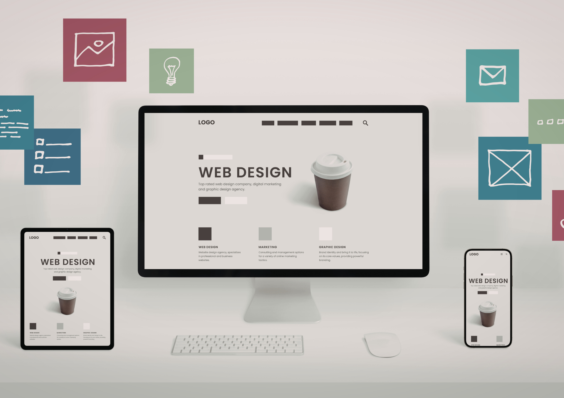
Mobile visitors should receive the same level of clarity and professionalism as desktop users. A responsive layout needs to do more than shrink content; it should adapt information and interactions to the practical realities of smaller screens.
Businesses can improve mobile usability by focusing on several areas:
- Keep important information visible without requiring excessive scrolling before users understand the page.
- Use comfortable text sizes that do not require visitors to zoom.
- Make buttons and links large enough for reliable touch interaction.
- Leave sufficient spacing between clickable elements to reduce accidental taps.
- Simplify menus so they remain easy to navigate on narrow screens.
- Optimise images to maintain visual quality without unnecessarily increasing loading times.
- Keep enquiry and contact forms concise, particularly when users may be completing them with one hand.
- Test content at multiple screen sizes rather than assuming one mobile layout will work everywhere.
- Avoid intrusive elements that cover important content or make navigation difficult.
- Ensure telephone numbers, booking options, and other key actions are convenient to use on mobile devices.
Some businesses compare the best website builders when looking for an accessible way to create responsive pages. Although many platforms provide mobile-ready templates, businesses should still test the finished experience carefully because automatic responsiveness does not guarantee that content hierarchy, navigation, or interactions will work effectively on every device.
Mobile performance is particularly important for visitors who are browsing while travelling, shopping, or comparing businesses quickly. They may have less time and patience than desktop users, making unnecessary steps more noticeable.
Forms deserve special attention. Asking for too much information can make completion difficult on a small screen. Where possible, businesses should request only the information required for the next stage and provide clear feedback when a form has been submitted successfully.
The same principle applies to product browsing. Categories, filters, product information, and basket controls should remain manageable on smaller displays. Testing real customer journeys is often more valuable than simply checking whether a page technically fits on a mobile screen.
Build for Performance, Accessibility, and Future Growth
A successful business website should continue to perform effectively after launch. As organisations introduce new content, campaigns, services, and functionality, the underlying platform must be able to accommodate change without becoming difficult to manage.
Performance is one part of this long-term approach. Large media files, unnecessary scripts, excessive plugins, and complicated page elements can gradually slow a site down. Regular optimisation helps maintain responsive interactions and reduces the likelihood that visitors abandon pages because they take too long to load.
Accessibility should also form part of everyday planning. Clear headings, meaningful link text, appropriate contrast, keyboard-friendly interactions, and useful alternative text for relevant images can make content easier for a wider range of people to use. Many accessibility improvements also contribute to general usability by making information more structured and predictable.
Businesses should think about maintenance before the site becomes difficult to manage. Clear templates, reusable components, and organised content structures make routine updates more efficient. They also reduce the risk of individual pages gradually developing inconsistent layouts.
Experienced website developers can help establish technical foundations that accommodate changing requirements without compromising stability. This becomes increasingly important when businesses introduce integrations, larger product catalogues, booking functionality, customer portals, or more complex content.
Scalability does not mean adding every possible feature at launch. In many cases, a simpler platform with a well-considered foundation is more valuable than an unnecessarily complex system. The objective is to create enough flexibility for realistic future requirements while keeping the current experience straightforward.
Effective web page design therefore considers longevity alongside immediate appearance. Businesses benefit from asking whether new sections can be added easily, whether existing content can be updated efficiently, and whether the overall structure will remain understandable as the organisation expands.
Regular review is also worthwhile. Customer expectations, devices, business priorities, and digital technologies change over time. Periodically examining navigation, page performance, content accuracy, and conversion journeys helps identify opportunities for improvement before small problems become significant limitations.
A strong business website experience comes from many connected decisions. Clear structure helps visitors understand information, straightforward navigation makes exploration easier, consistent presentation reinforces credibility, and mobile optimisation ensures the experience works across devices. Performance, accessibility, and scalability then help protect that experience over the longer term.
For homeware brands, health and wellness businesses, retailers, and entrepreneurs, the goal should be to create a digital environment that supports real customer needs rather than simply following visual trends. Every page should contribute to clarity and provide visitors with a sensible route towards the information or action they need.
Thoughtful web page design creates a stronger foundation for this experience. By balancing presentation with usability and future flexibility, businesses can develop websites that remain useful, professional, and adaptable as their needs evolve.
ETA Web Design Bath provides practical digital solutions for businesses seeking a professional online presence built around real objectives. We take time to understand how an organisation operates, what its customers need, and how its website may need to evolve in the future.
Our approach focuses on clear structure, intuitive navigation, responsive layouts, and dependable performance. Rather than adding unnecessary complexity, we aim to create purposeful websites where content, visual presentation, and functionality work together naturally.
For businesses in Bath and those serving customers across wider areas, we focus on scalable solutions that can adapt as products, services, and priorities change. This long-term approach helps create a digital platform that remains manageable, credible, and useful as the business develops.
Check out our latest X update featuring useful
web page design tips to improve your business website experience!